

Backdrop Philosophy
Backdrops are an interesting beast. There are many philosophies as to what the role of a model railroad backdrop should be and which technique best achieves that role. Some will say that painting a quick and simple, flat blue sky and perhaps a hint of distant hills is best for giving an impression of an extended environment while also not drawing too much attention to itself and allowing the focus of the scene to remain on the models. Others will argue that a highly detailed, extremely realistic backdrop composed of mostly photographic elements will help to set your models into the scene and is less likely to betray the effect of realism that model railroaders strive for in their work. My opinion on what makes an effective backdrop falls somewhere in between.
An extremely simple backdrop consisting of a flat-blue sky and perhaps some sponge-painted hills can be very effective in urban and rural plains scenes. But I've seen examples of railroads set in mountainous terrain where that effect can look rather cartoonish and can become a big distraction. Mountains are naturally very dramatic locals and they really demand careful attention be paid to effectively create the impression of realism.
Photo backdrops have become very popular in recent years and there are some truly stunning examples of the realism that photo backdrops provide. Mike Confalone's Allagash Railway is a perfect example of this and It's hard to argue with those kind of results, yet I have seen examples where such realism in the backdrop actually makes the modeled elements look worse by comparison. Particularly in scenes where less-than-stellar tree models need to stand side-by-side with photographs. Also, the color balance of many photo backdrops often differ slightly from the modeled portion of the scene which can also draw attention to itself and distract the viewers attention from the scene.
In most situations, I feel that the best approach is a carefully painted backdrop with a medium amount of detail. This approach blend nicely with the modeled scenery without becoming a distraction. Bernie Kempinski's USMRR is the perfect example of the effectiveness of this technique.
Preparing to Paint

The first step was to gather all the paints and supplies I'd need to complete the layout. This Included:
- A quart of light, greyish-blue flat enamel paint
- A quart of tan flat enamel paint (Upon reflection, I probably should have gone with more of a dirt brown color, but this works fine for now.)
- A 4oz tube of Liquitex Basics Mars Black
- A 4oz tube of Liquitex Basics Cerulean Blue Hue
- A 4oz tube of Liquitex Basics Hookers Green Hue
- A 4oz tube of Liquitex Basics Cadmium Yellow Medium Hue
- A 4oz tube of Liquitex Basics Titanium White
- A 2oz tube of Liquitex Raw Siena
- A 8oz bottle of Liquitex Acrylic Matte Medium
- A pad of Pallet Paper
- A package of assorted cheap brushes and sponge brushes
- A package of assorted cheap pallet knives
Acrylics can be expensive, and you'll need a lot of it to cover your backdrop, so the key here is to be as CHEAP as possible. Liquitex's Basics line of paints are significantly cheaper than their traditional line and stores like Hobby Lobby will sometimes offer them for sale at a deep discount. Artist brushes can be expensive as well, so for an application such as this I recommend getting a package of cheap brushes. These too can be found at Hobby Lobby at about ten bucks for a dozen or so brushes of various shapes and sizes.
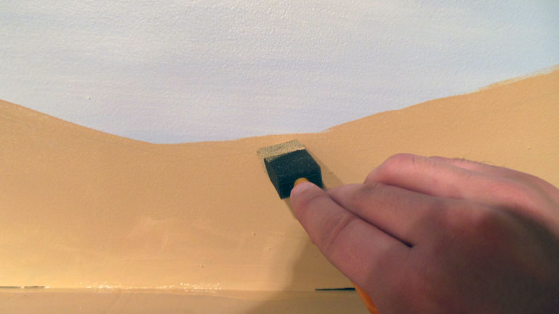
Painting the Sky
When painting your backdrop, it's important to start with the most distant elements first and work your way forward from there. With this in mind, I began by painting the sky.
The first step was to roll on a layer of light, greyish-blue flat enamel house paint across the entire backdrop. When selecting a color for your sky, it is important to choose a color that is not too blue. If you take a look at the sky on an average day, you'll find it to be far lighter and more grey than you might initially think.
Once the paint has dried, it was time to add the clouds. Clouds can be difficult to get right. Generally I find that puffy, round, dimensional clouds often look unconvincing. I prefer wispy clouds that add a sense of depth to the sky without drawing too much attention to it.
Using a sheet of pallet paper and a pallet knife I thinned out a large amount of Titanium White with Matte Medium and a bit of water. I then applied the paint to the backdrop with a large soft bristled brush in long horizontal strokes. I placed most of the clouds near the bottom of backdrop and created fewer, larger clouds as I worked my way up the backdrop. This helps to simulate depth in the sky.
After the paint dried, I went back with a slightly thicker mix of Titanium White and Matte Medium and added a few puffy areas on the tops of the clouds to add a bit of definition.
Painting Distant Mountains

Using photographs as refrence, I mixed up a very large amount of paint to simulate the most distant layer of trees. This color was a mix of Cadmium Yellow, Cerulean Blue, Titanium White, and a bit of Mars Black. (Mars Black is a very powerful color and a little bit goes a long way when mixing colors) I applied the paint to the backdrop with a brush using short, vertical strokes. These strokes give the appearance of tall, thin, distant pine trees.
Next I mixed up a somewhat darker, more green mix of paint using the paint left over from the first coat and applied it slightly lower on the canvas using the same vertical strokes. This simulates a tree line that is not quite as far away. A final mix of darker, more olive green paint was used to create the nearest tree line. I took the extra step of adding some branch detail to this layer to which gives the appearance of closer, more visible trees.
Painting Trees

Don't worry too much about making perfect trees. In my case, most of these will be covered by modeled trees and building flats. These painted trees exist mainly to give an impression of a thick, dense forrest and so color is more important here than detail. I would suggest having a few modeled trees available as reference to match colors to. That way the backdrop will blend seamlessly into the rest of the layout.
I began by mixing a thick, dark green color using mostly Cadmium Yellow and Mars Black with a hint of Hookers Green and Cerulean Blue for good measure. If you find that your color is too saturated, try adding some Titanium White to the mix to dull it a bit. (PRO TIP: mixes of Cadmium Yellow and Mars black in various amounts will give you colors that very nearly match many of the shades of green found in most Woodland Scenics products)
I applied the paint to the backdrop using a fan brush starting with small branches at the top of the tree and working my way down from there. I tried to create trees of various sizes and shapes to add a bit of character to the forest and to avoid it turning into a solid wall of green. Once that coat dried, I went back over it with a lighter shade of green being careful not to cover too much of the dark green as that is meant to represent the shadowy areas of the tree. A final coat of lighter green with a hint of Cadmium Yellow for highlights and the trees were done for the moment.
Painting Ground Cover and Details


Finally, upon review I decided to add a few young saplings and dead trees in various spots to break up the monotonous look of a wall of perfect pines.
A World of Difference
If you are putting off painting your backdrop because you are afraid of messing it up, don't be. If you do screw up, you can always paint over it and try again. It took me several tries to get this backdrop just right and I had to repaint some areas several times until I had the color just right. It's an easy fix and it's better to do it at this stage than to try and fix a backdrop that you're not happy with after all of the hills and trees and plaster castings have gone in.
I must admit I was dreading painting my own backdrop. It had been years since I last picked up a brush to paint anything and I really didn't want to screw it up. But I gotta tell ya, the addition of a painted backdrop makes a world of difference on my model railroad. I haven't added any real scenery yet, but already it feels like my trains are moving through a real location instead of rolling over a piece of painted foam. This has me excited to run trains and to get going on my next model railroad project.

Nice how-to post, Matt! Very informative.
ReplyDeleteTom
That's a very encouraging post. (Sorry about the time-lapse between it and my comment, but I was unaware of your blog until yesterday!)
ReplyDeleteI have been holding back on painting my backscene, out of a desire to get a "fading to white" at the horizon, but I can see that by using a greyish blue, that is largely unnecessary as the grey creates an imitation of atmospheric haze, and the issue becomes redundant.
Nice one.
Simon